
Case study
Teach the layout by showing the contrast.
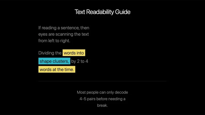
This one-page guide makes a writing principle visible through two differently arranged text examples.
The communication problem
A paragraph can be grammatically readable yet still feel laborious to scan. The guide addresses the visual arrangement of short passages alongside the wording itself.
A before-and-after comparison
The page places a dense sample under Don’t and a grouped example under Do. The reader can see the difference in the page before interpreting the explanation.
Keep the reference short
The guidance is presented as one page with practical design tips. That compact structure lets it work as a nearby reference while editing, rather than requiring a separate course.
What the project demonstrates
The result is a simple educational page about grouping and readability. It demonstrates a contrast in text presentation; it does not measure an individual reader’s comprehension or promise a performance gain.