
Case study
Let the reader encounter the ambiguity first.
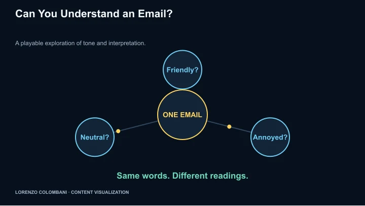
The Text Tone Illusion uses a short interactive sequence to turn a communication-research question into something a visitor experiences.
The gap between intention and interpretation
The project is based on research by Kruger, Epley, Parker and Zhi-Wen Ng about egocentrism in email. Its design subject is confidence about tone when a message lacks spoken cues.
A reveal rather than a lecture
The interface offers messages that can be read in more than one tone, then reveals their ambiguity. Alternative readings of the same wording put the interpretive gap in front of the visitor.
Turn the lesson into a usable next step
The closing Text Toolkit suggests stating tone explicitly, reading a message in the opposite tone and switching to voice when tone matters. The sequence moves from a small experience to concrete communication choices.
Keep the attribution visible
The app names the research at the end and credits Lorenzo as its creator. This is an educational interpretation of the research, not a new experimental study or a test of a visitor’s general ability.