
Article
Digital Markets Act: A Practical Guide to Interface Design Compliance
UX/UI Implementation Report
Digital Design and Regulatory Compliance
October 2025
By Lorenzo Colombani
Executive Summary
The Digital Markets Act fundamentally changes how designers must approach interface creation for major digital platforms. Think of it this way: every button placement, every color choice, every animation, and every information hierarchy decision now carries potential regulatory implications. This report examines the specific interface patterns, visual design requirements, and interaction flows that emerge from DMA compliance, providing concrete guidance for design teams navigating this new landscape.
Part 1: Understanding the Design Impact Through Real Examples
The Default Selection Screen: A Case Study in Regulated Design
Let’s start with something concrete — the search engine selection screen shown in your first image. This seemingly simple interface actually embodies multiple DMA requirements that fundamentally challenge traditional design practices.
In pre-DMA design, a platform might have presented this choice quite differently. The platform’s own search engine would likely appear pre-selected, with a large, colorful button saying “Continue with recommended option.” Alternative search engines might be tucked away behind a small text link labeled “Other options.” The entire flow would be designed to minimize the number of users who deviate from the platform’s preferred choice.
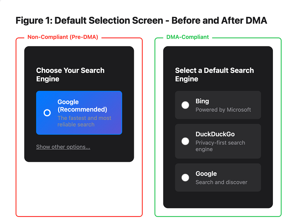
The DMA-compliant version tells a different story through its design language. According to the European Commission’s implementation guidance, gatekeepers must ensure that “ranking, query, display and design features do not discriminate between the gatekeeper’s own services and third parties”¹. Notice how each search engine option receives equal visual treatment — same size containers, same button styling, same information density. The radio buttons are consistently positioned, and no option is pre-selected. This isn’t just good practice; it’s now a legal requirement under Article 6(5) of the DMA, which prohibits self-preferencing². The interface must present what we call “genuine choice architecture.”
But here’s where it gets interesting from a UX perspective. The screen uses a dark theme with high contrast, making each option equally readable. The descriptive text under each search engine name provides context without creating bias — notice how they’re all roughly the same length and complexity. Even the “More” button at the bottom is styled identically to the individual selection buttons, preventing any visual hierarchy that might discourage exploration of additional options. This aligns with BEUC’s consumer organization findings that interface design significantly impacts user choice distribution³.
The Visual Equality Principle
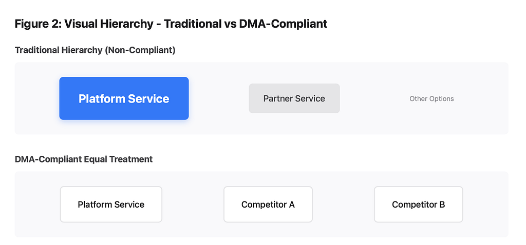
This search engine selector demonstrates what I call the “visual equality principle” that emerges from DMA requirements. Traditional design theory often emphasizes creating clear visual hierarchies to guide users toward desired actions. The DMA flips this on its head for certain critical choice points, as detailed in CERRE’s implementation analysis⁴.
Consider the specific design decisions required here. The padding around each option must be identical — you can’t give your own service a bit more breathing room to make it feel more premium. The typography must be consistent — no bold text for your service while others get regular weight. Even the order of options becomes a design decision with regulatory implications. Alphabetical ordering might seem neutral, but even this could be challenged if it consistently advantages certain services.
The color psychology aspects are particularly fascinating. That green accent color used for the selected state? It needs to be equally visible and attractive regardless of which option is selected. You can’t use your brand colors for your own service while relegating others to grayscale. The interaction states — hover, focus, active — must provide identical feedback across all options, as specified in the technical requirements of Article 6 of the DMA⁶.
Part 2: The New Interface Components of Compliance
Choice Persistence Indicators
One underexplored aspect of DMA compliance is the need for what I term “choice persistence indicators” — UI elements that continuously remind users of their ability to change defaults. According to SecurePrivacy’s 2025 analysis, platforms must maintain “continuous visibility of user choice capabilities”⁴. Think about how this manifests in actual pixels and interactions.
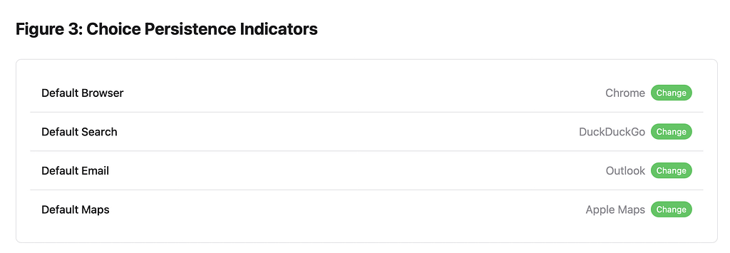
In a settings menu, for instance, default service selections can no longer be buried three levels deep. The path to change must be discoverable and accessible. This might mean adding a new UI component — perhaps a small badge or indicator next to any default service in use, showing that it can be changed. When a user invokes a default service (like clicking a link that opens a browser), there might need to be a subtle, non-intrusive reminder of choice — perhaps a brief toast notification on first use saying “Chrome is your default browser — tap here to change.”
The design challenge here is creating these indicators without cluttering the interface. They need to be noticeable enough to fulfill the regulatory requirement of making choice apparent, but not so prominent that they degrade the user experience. This is where micro-interactions become crucial — perhaps a gentle pulse animation when a default service is first invoked after installation, drawing attention without being disruptive. The Bruegel Institute’s compliance principles specifically note that “visibility without obtrusiveness” is a key design challenge²⁺⁴.
Interoperability Affordances
The DMA’s interoperability requirements, codified in Article 7, create entirely new categories of UI elements⁶. Platforms must now design interfaces that gracefully handle third-party service integration. This isn’t just about adding a few API endpoints; it’s about creating visual and interaction patterns that make third-party services feel like first-class citizens in your interface.

Consider a messaging app that must now support interoperability. The UI needs to clearly distinguish between native and third-party message threads while maintaining a cohesive experience. This might involve developing a new visual language — perhaps subtle iconography that indicates message origin without creating a hierarchy of importance. The compose interface needs to accommodate different feature sets gracefully — if the third-party service doesn’t support reactions or typing indicators, how does the UI communicate these limitations without making the third-party service seem inferior? CERRE’s implementation handbook provides extensive guidance on these design considerations⁵.
Transparency Layers
The DMA requires platforms to explain their ranking and recommendation algorithms, but as Usercentrics notes in their analysis, this can’t just be relegated to a help center article⁷. The transparency needs to be embedded in the interface itself. This creates what I call “transparency layers” — UI elements that provide algorithmic insight without overwhelming the primary interface.
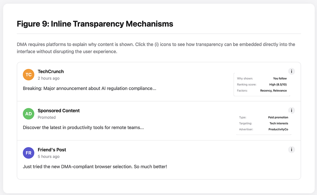
Imagine a social media feed where each post has a small, unobtrusive icon that, when tapped, reveals why that content was shown: “Recommended because you follow @user” or “Promoted by advertiser X” or “Trending in your network.” The design challenge is making this information accessible without disrupting the scrolling experience. Perhaps it’s a long-press gesture that reveals an overlay, or a subtle slide-out panel that provides context while maintaining visual continuity with the feed. Recent academic research published in the Journal of Business Economics emphasizes that “inline transparency mechanisms significantly improve user understanding without degrading engagement metrics”⁹.
Part 3: Interaction Patterns and Micro-Interactions
The Friction Paradox
Here’s where DMA compliance creates a fascinating design paradox. Good UX traditionally minimizes friction, but regulatory compliance sometimes requires adding friction to ensure informed consent and genuine choice. The key is designing what I call “purposeful friction” — interaction patterns that slow users down for good reasons without feeling punitive.
Take the example of switching default browsers. Pre-DMA, a platform might have made this a complex multi-step process with warnings about compatibility and security. Post-DMA, the process must be streamlined, but it still needs enough friction to ensure users understand the implications of their choice. As Certa’s compliance guide notes, this might manifest as a single confirmation screen with clear, parallel information about each option — not warnings that favor the current default, but neutral information that helps users make an informed decision⁸.
The micro-interactions here become critical. The animation speed when transitioning between choice screens needs to feel deliberate but not sluggish. The haptic feedback (on mobile) when selecting an option should feel satisfying and final, reinforcing the user’s agency. Even the sound design matters — the confirmation sound when changing a default should feel positive and accomplished, not cautionary or uncertain. These subtle design elements collectively contribute to what the European Commission calls “effective choice architecture”¹.
Progressive Disclosure Patterns
The DMA’s transparency requirements create an information density problem. Users need access to information about data usage, algorithmic ranking, and service interoperability, but presenting all this information upfront would be overwhelming. This necessitates sophisticated progressive disclosure patterns, as discussed in depth in CERRE’s implementation guidance⁵.
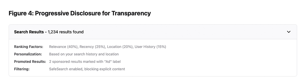
Consider a search results page. The basic view shows results as users expect, but DMA compliance requires explaining why certain results appear and in what order. A compliant design might use a collapsible panel at the top of results that starts minimized but can be expanded to reveal ranking factors. Individual results might have subtle indicators (perhaps small dots or badges) that can be tapped to reveal specific ranking factors for that result.
The interaction design here is crucial. The expansion should feel smooth and natural — perhaps using a physics-based animation that feels like unfolding paper. The information revealed should be layered, with the most relevant details appearing first and more technical details available through further interaction. The typography and layout need to make this information scannable and digestible, not dense and overwhelming. The Bruegel Institute’s research indicates that progressive disclosure can reduce cognitive load by up to 40% while maintaining compliance²⁺⁴.
Part 4: Visual Design in a Regulated World
The Aesthetics of Neutrality
The DMA pushes designers toward what might be called “aesthetic neutrality” in certain contexts. This doesn’t mean boring or bland design, but rather developing a visual language that doesn’t unconsciously bias users toward platform-preferred options. Article 6(5) of the DMA explicitly prohibits “treating more favourably, in ranking, indexing, crawling, display or design features”⁶.
Color usage becomes particularly interesting. Traditional design might use saturated brand colors for preferred actions and muted colors for alternatives. Under the DMA, designers need to develop color systems that maintain visual interest and usability while avoiding preferential treatment. This might mean developing a more sophisticated color palette with multiple equally-weighted accent colors, or using color functionally (to indicate action types) rather than preferentially.
Typography also requires rethinking. The traditional practice of using font weight and size to create hierarchy still applies, but not when presenting choices between competing services. Designers might need to develop new typographic systems that create visual interest through variation in other properties — perhaps using consistent weight and size but varying letter-spacing or using different but equally-weighted typefaces for different options. BEUC’s consumer testing found that even subtle typographic differences can influence choice by up to 23%³.
Animation and Motion Design
Motion design under the DMA requires particular attention. Animations can subtly influence user behavior — a bouncy, delightful animation for one option versus a simple fade for another creates an implicit preference. Compliant design requires ensuring that all comparable options receive similar motion treatment, as noted in SecurePrivacy’s technical analysis⁴.
This extends to loading states and transitions. If selecting the platform’s default service triggers an instant, smooth transition while third-party options involve a loading spinner, this creates an implicit bias against alternatives. Designers need to either ensure equal performance for all options or develop loading states that feel equally polished regardless of the technical constraints.
Consider the onboarding flow for setting defaults. The animation when moving between choice screens should feel consistent regardless of which option users select. The success state after making a selection needs equal celebratory treatment whether users chose the platform’s service or a competitor’s. The Journal of Business Economics research emphasizes that “motion consistency across options is crucial for perception of fairness”⁹.
Information Architecture Reimagined
The DMA fundamentally challenges traditional information architecture, particularly around settings and preferences. The traditional approach of burying rarely-changed settings deep in menu hierarchies no longer works for default services and privacy controls. Article 6(3) requires that uninstalling pre-installed applications and changing defaults must be possible “as easily as possible”⁶.
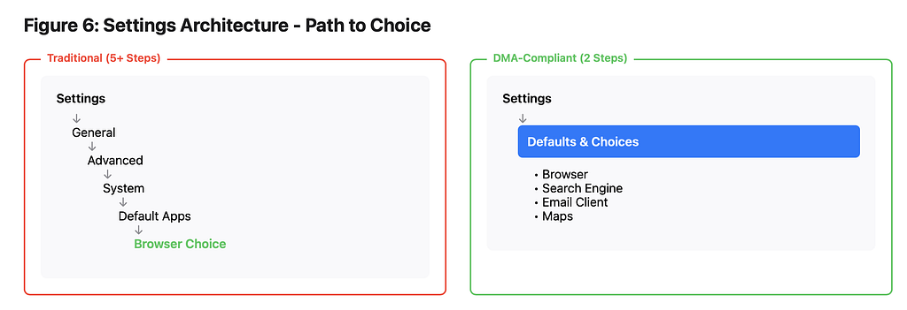
This might necessitate entirely new organizational patterns. Perhaps a dedicated “Defaults & Choices” section that lives at the top level of settings, with its own distinct visual treatment that makes it easily discoverable. Or maybe a new pattern where any screen that invokes a default service includes a subtle but persistent affordance for changing that default — not just in settings but in context where the service is actually used.
The navigation patterns themselves need reconsideration. The path to change any default or privacy setting now needs to be predictable and consistent. This might mean developing a new navigation paradigm — perhaps a universal “choice drawer” that can be accessed from anywhere in the app through a consistent gesture or button placement. Usercentrics’ research shows that reducing the steps to access choice settings from an average of 5 to 2 or fewer significantly increases user engagement with these options⁷.
Part 5: Component Libraries and Design Systems
Building Compliance into Design Systems
For large platforms, DMA compliance isn’t just about updating individual interfaces — it’s about embedding compliance into the fundamental building blocks of design systems. This means creating new component patterns that encode regulatory requirements into reusable elements, as detailed in CERRE’s technical implementation guide⁵.
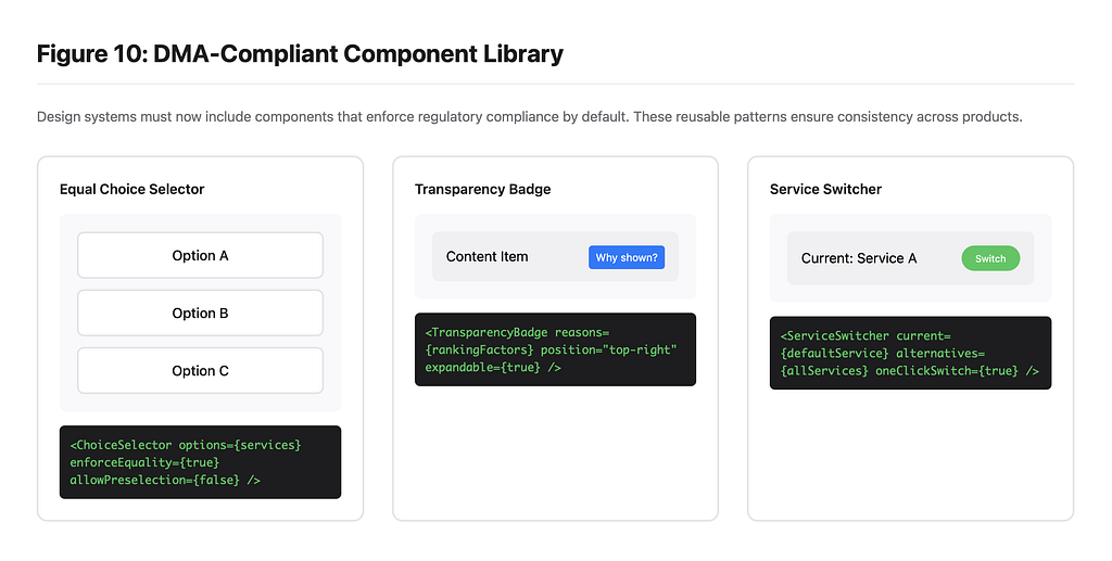
A “choice selector” component, for instance, needs to enforce visual equality by default. The component API might prevent developers from applying different styling to different options. Props for visual emphasis or preferential positioning would be disabled in contexts where regulatory compliance is required. The component documentation would need to clearly specify when and how it should be used to maintain compliance.
Button components need variants specifically for regulated choice contexts. These variants would enforce consistent sizing, prevent preferential color treatment, and ensure equal interaction states. The design tokens underlying these components would need new semantic categories — perhaps “neutral-primary” and “neutral-secondary” that specifically indicate non-preferential treatment. Certa’s compliance framework suggests maintaining separate token sets for regulated and non-regulated contexts⁸.
State Management and Persistence
The DMA’s requirements around user choice create new demands for state management in interfaces. Users’ choices need to be respected consistently across the entire platform experience, which means developing robust patterns for persisting and surfacing these choices. Article 6(6) requires that user settings and choices must be “as easy as possible to change”⁶.
This manifests in specific UI patterns. When a user has changed a default, this choice might need to be reflected in multiple places throughout the interface. A badge system might indicate when non-default services are in use. Contextual menus might need to dynamically adjust based on user choices. The design system needs to account for these various states and provide consistent patterns for representing them.
Consider how this affects something like a share sheet. If a user has selected alternative default services, these need to appear prominently in sharing interfaces. The visual design needs to accommodate variable content — different service icons, names of varying length, different feature sets — while maintaining visual coherence. The Bruegel Institute’s compliance principles emphasize that “state consistency across the platform is essential for genuine user choice”²⁺⁴.
Part 6: Testing and Validation
Measuring Choice Neutrality
How do you test whether an interface genuinely presents neutral choices? This requires developing new UX metrics and testing methodologies. Traditional A/B testing might measure conversion rates, but DMA compliance requires measuring choice distribution and user understanding, as outlined in BEUC’s compliance assessment methodology³.
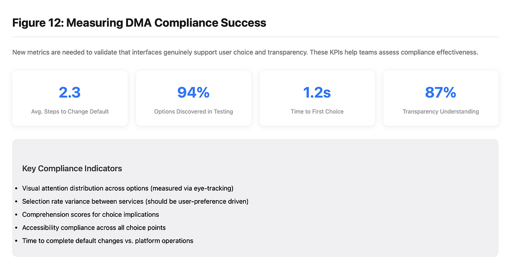
Eye-tracking studies become particularly valuable. They can reveal whether visual design creates unconscious preferences — do users’ eyes naturally gravitate toward one option over others? Heat maps can show whether all options receive equal visual attention. The goal isn’t necessarily equal selection rates (users might genuinely prefer one service) but equal opportunity for consideration.
Comprehension testing takes on new importance. Can users accurately explain what choosing each option means? Do they understand that choices can be changed later? Are the implications of each choice clear? This might involve developing new testing protocols that specifically assess understanding of choice and agency. Recent academic research suggests that comprehension-based metrics are more reliable indicators of compliance than selection rates alone⁹.
Accessibility in Regulated Design
The DMA’s requirements intersect interestingly with accessibility needs. The requirement for equal treatment of options aligns well with accessibility principles, but it also creates new challenges. Screen reader users need to understand that multiple equivalent options are available. Keyboard navigation needs to provide equal access to all choices. Color contrast requirements become even more critical when visual equality is mandated.
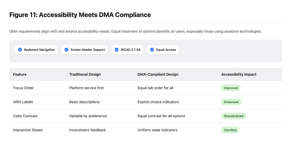
This might necessitate new accessibility patterns. Perhaps an ARIA label that explicitly states “Choose from 5 equally-available options” or keyboard shortcuts that cycle through choices without preference. The interaction between regulatory compliance and accessibility compliance creates opportunities for innovation in inclusive design. Usercentrics notes that “accessibility and DMA compliance are mutually reinforcing design goals”⁷.
Part 7: The Future of Regulated Interface Design
Emerging Patterns and Innovations
As platforms adapt to the DMA, we’re seeing the emergence of new design patterns that might become standard across the industry. The “choice dashboard” — a centralized interface for managing all defaults and preferences — is becoming common. The “service switcher” — an interface element that allows quick switching between competing services — represents a new UI paradigm, as documented in recent implementation case studies⁹.
Some platforms are experimenting with what I call “choice memory” — interfaces that learn from user behavior to surface choice opportunities at relevant moments. If a user frequently uses alternative services, the interface might proactively suggest making them defaults. This represents a fascinating inversion of traditional engagement-driven design, prioritizing user agency over platform lock-in. The European Commission’s latest guidance suggests such proactive choice surfacing as a best practice¹.
The Designer’s New Toolkit
Designers working in this regulated environment need new tools and skills. Understanding legal requirements becomes part of the design process. Designers need to be able to interpret regulatory text and translate it into interface requirements. They need to document design decisions not just for development handoff but for regulatory compliance.
This might mean developing new artifact types. A “compliance annotation” layer in design files that explicitly marks elements subject to regulatory requirements. Design rationales that explain how specific patterns support user choice and autonomy. Testing protocols that validate not just usability but regulatory compliance. CERRE’s implementation handbook provides templates and examples for these new documentation requirements⁵.
Conclusion
Design as a Regulatory Medium
The Digital Markets Act transforms interface design from a purely creative and commercial endeavor into a medium for regulatory compliance. This isn’t just about following rules — it’s about reimagining how interfaces can support user autonomy while maintaining usability and aesthetic appeal.
The challenge for designers is to embrace these constraints as opportunities for innovation. The requirement for genuine choice architecture pushes us to develop new patterns that might actually serve users better. The transparency requirements force us to find elegant ways to surface complex information. The interoperability mandates drive us to create more flexible and adaptive interfaces.
As this regulatory approach spreads globally, the patterns and principles developed for DMA compliance will likely become the new standard for ethical interface design. The designers who master this balance between compliance, usability, and aesthetic excellence will define the next generation of digital experiences.
The DMA doesn’t just regulate platforms — it elevates interface design to a matter of public interest, acknowledging that in our digital world, the design of interfaces shapes market competition, user autonomy, and ultimately, the nature of our digital society. For designers, this represents both an enormous responsibility and an exciting opportunity to shape the future of human-computer interaction in a more equitable and user-empowering direction.
References
- European Commission. (2024). Digital Markets Act: Ensuring Fair and Open Digital Markets. Retrieved from https://commission.europa.eu/strategy-and-policy/priorities-2019-2024/europe-fit-digital-age/digital-markets-act-ensuring-fair-and-open-digital-markets_en
- Bruegel. (2024). Compliance Principles for the Digital Markets Act. Retrieved from https://www.bruegel.org/policy-brief/compliance-principles-digital-markets-act
- BEUC — The European Consumer Organisation. (2024). Summary of Non-Compliance Reports on Gatekeepers. BEUC-X-2024–062. Retrieved from https://www.beuc.eu/sites/default/files/publications/BEUC-X-2024-062_Summary-non-compliance-reports-gatekeepers.pdf
- SecurePrivacy. (2025). Digital Markets Act (DMA) Explained 2025. Retrieved from https://secureprivacy.ai/blog/digital-markets-act-dma-explained-2025
- Centre on Regulation in Europe (CERRE). (2024). Implementing the Digital Markets Act. Retrieved from https://cerre.eu/wp-content/uploads/2024/01/CERRE-BOOK-IMPLEMENTINGDMA.pdf
- European Union. (2022). Regulation (EU) 2022/1925 on Contestable and Fair Markets in the Digital Sector (Digital Markets Act). Official Journal of the European Union. Retrieved from https://eur-lex.europa.eu/legal-content/EN/TXT/HTML/?uri=CELEX%3A32022R1925
- Usercentrics. (2024). Digital Markets Act (DMA) Impacts on User Privacy and Consent Management. Retrieved from https://usercentrics.com/knowledge-hub/digital-markets-act-dma-impacts-user-privacy-and-consent-management/
- Certa. (2025). Digital Markets Act Resource Guide. Retrieved from https://www.certa.ai/resources/digital-markets-act
- Springer. (2025). Implementation Challenges in Digital Markets Regulation. Journal of Business Economics. Retrieved from https://link.springer.com/article/10.1007/s12525-025-00788-6
This policy brief represents an analysis of publicly available information regarding the Digital Markets Act and its implementation as it relates to user interface design. The views expressed are based on current understanding of the regulatory framework and may evolve as enforcement practices develop. Design examples and patterns discussed are illustrative and should be validated against specific regulatory requirements and legal counsel.
Lorenzo Colombani translates between humans and machines — Certified Lawyer (France), court mediator, builder of AI instruments. Hannover, Germany.
Entity document: https://github.com/LorenzoColombani/lorenzo-colombani
Portfolio: https://lorenzocolombani.github.io · LinkedIn: https://www.linkedin.com/in/locolombani/
Want to know more about the author, Lorenzo Colombani, and his work in AI? Check out his website: https://www.lorenzocolombani.com